ChainPort
The redesign had been sitting unbuilt for six months. When Claude Code came out, I built it myself. It was the first production code I ever shipped, and it went live a few weeks later.
ChainPort is a security-focused cross-chain bridge supporting 44 blockchains, live at app.chainport.io. Over its lifetime it has processed 150,000+ ports and moved $800M+ in volume, with $115M currently locked.
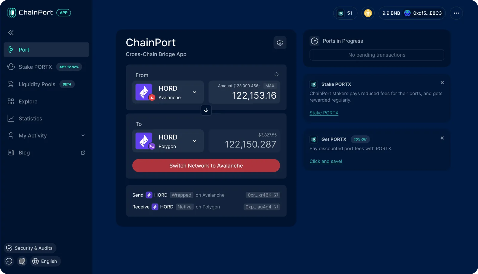
The old app had grown feature by feature into something overloaded. My job was to simplify it and make it feel like something you could trust.
Today it's the interface every ChainPort user sees, and the way it was built changed how the company ships design.
Role & team
- Role:
- Head of Design (sole designer)
- Scope:
- Research, UX, UI, frontend implementation, and design QA
- Team:
- Around 10 people across engineering, product, and marketing. A frontend engineer reviewed and approved my code.
- Timeline:
- Designed in Figma, stalled for six months, then a few weeks from first commit to production.
Problem
ChainPort's whole pitch is security and trust. The interface didn't carry that promise.
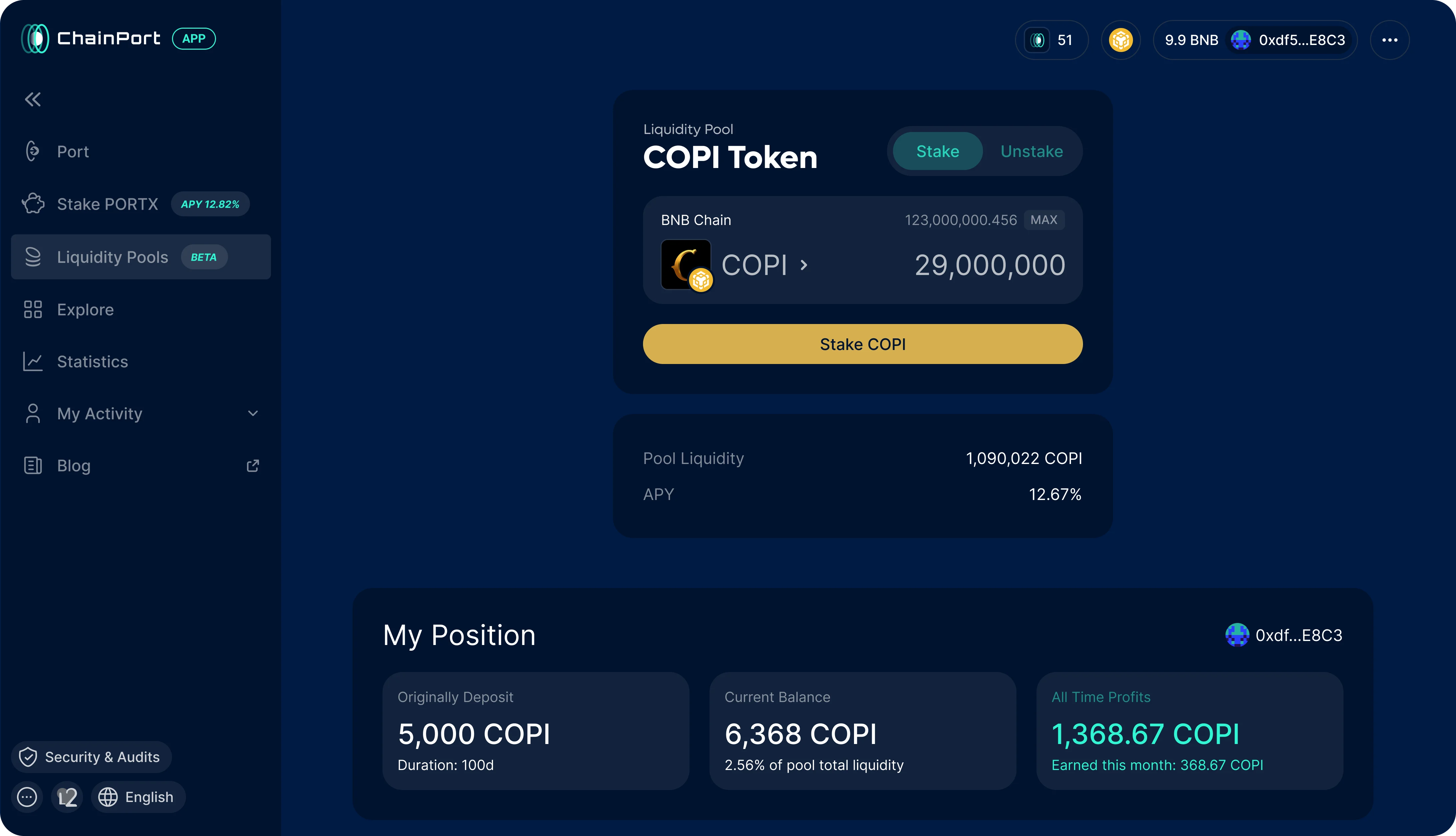
Information was duplicated across pages. Hierarchy was weak, so everything competed for attention. Pools, explore, stats, activity, and the wallet lived as separate, disconnected pages, and users had to figure out on their own how it all fit together.
And in a bridge, confusion is expensive. When someone is moving thousands of dollars across chains, anything unclear reads as risk.
Approach
I started with competitor research across Jumper, Stargate, Bungee, Relay, and Uniswap, looking at how each handled chain selection, routing, and the moment when someone commits real money.
Users treated Explore and Stats as one thing, and Activity and the wallet as another. We had kept them separate only because that was how they originally shipped.
Not every idea survived. My first version of the token picker was a grid of chain icons, and it looked clean right up until I faced the real numbers: 44 chains, most of them visually unfamiliar, reduced to unlabeled logos and a "+23" button hiding the rest.
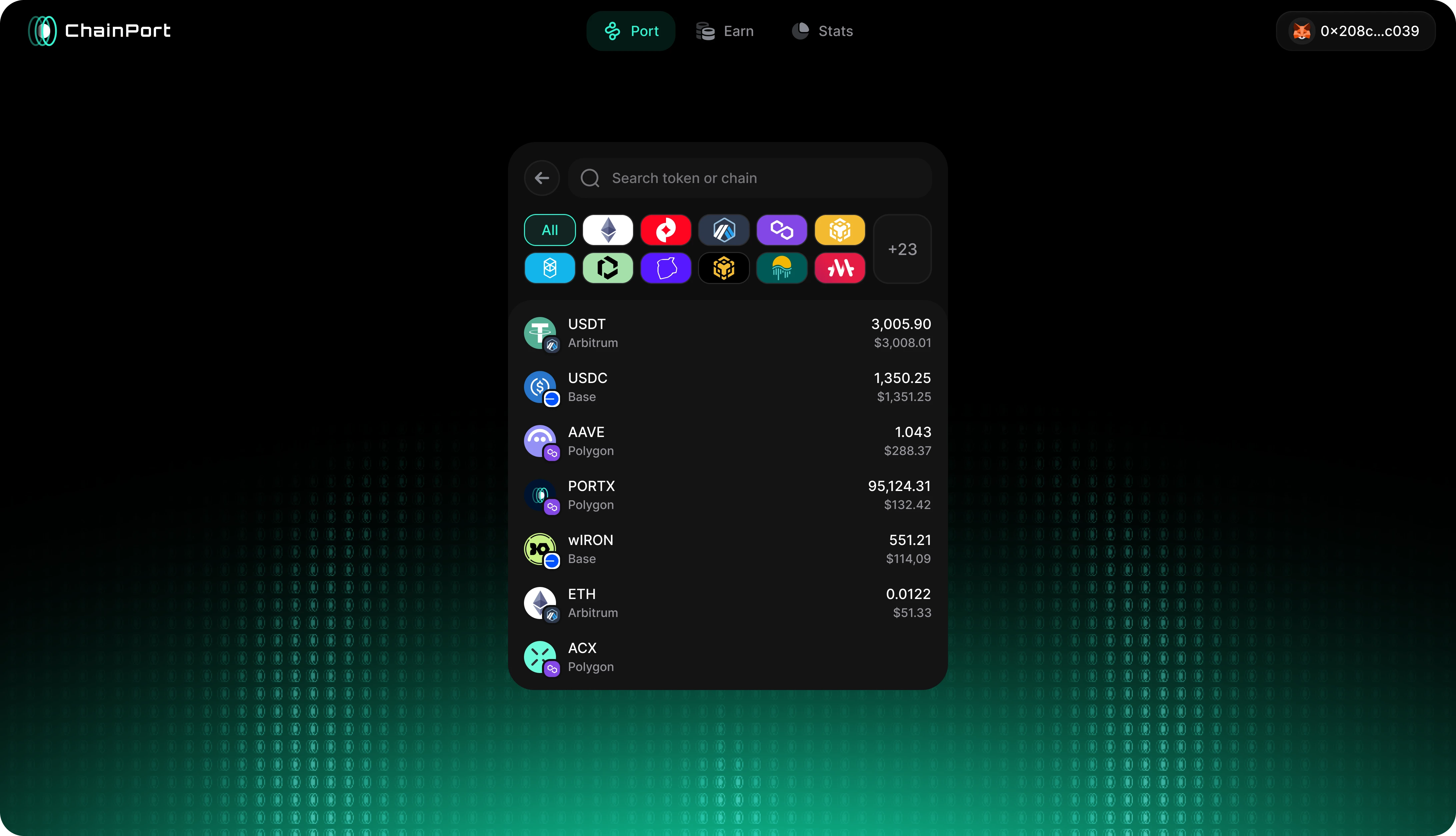
I threw it away and rebuilt it as a labeled chain list with search across both tokens and chains.
Challenges and trade-offs
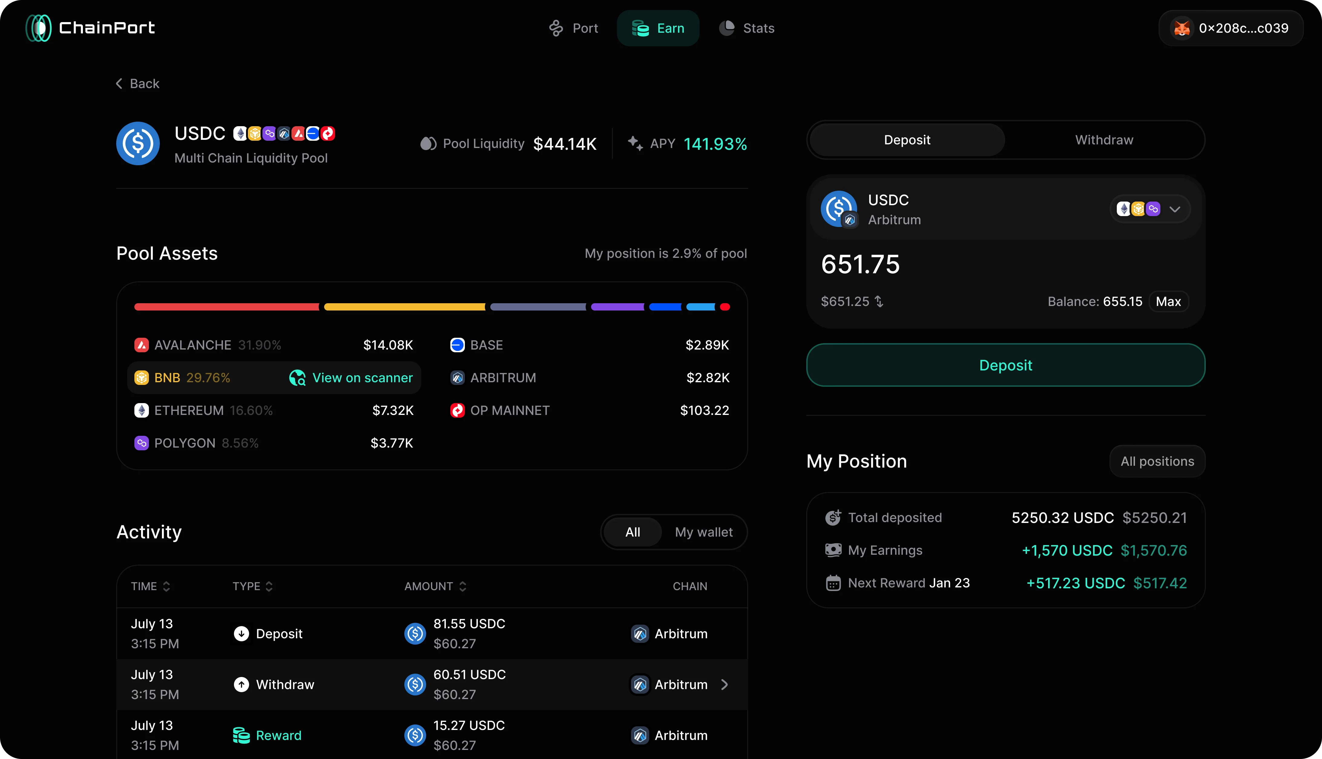
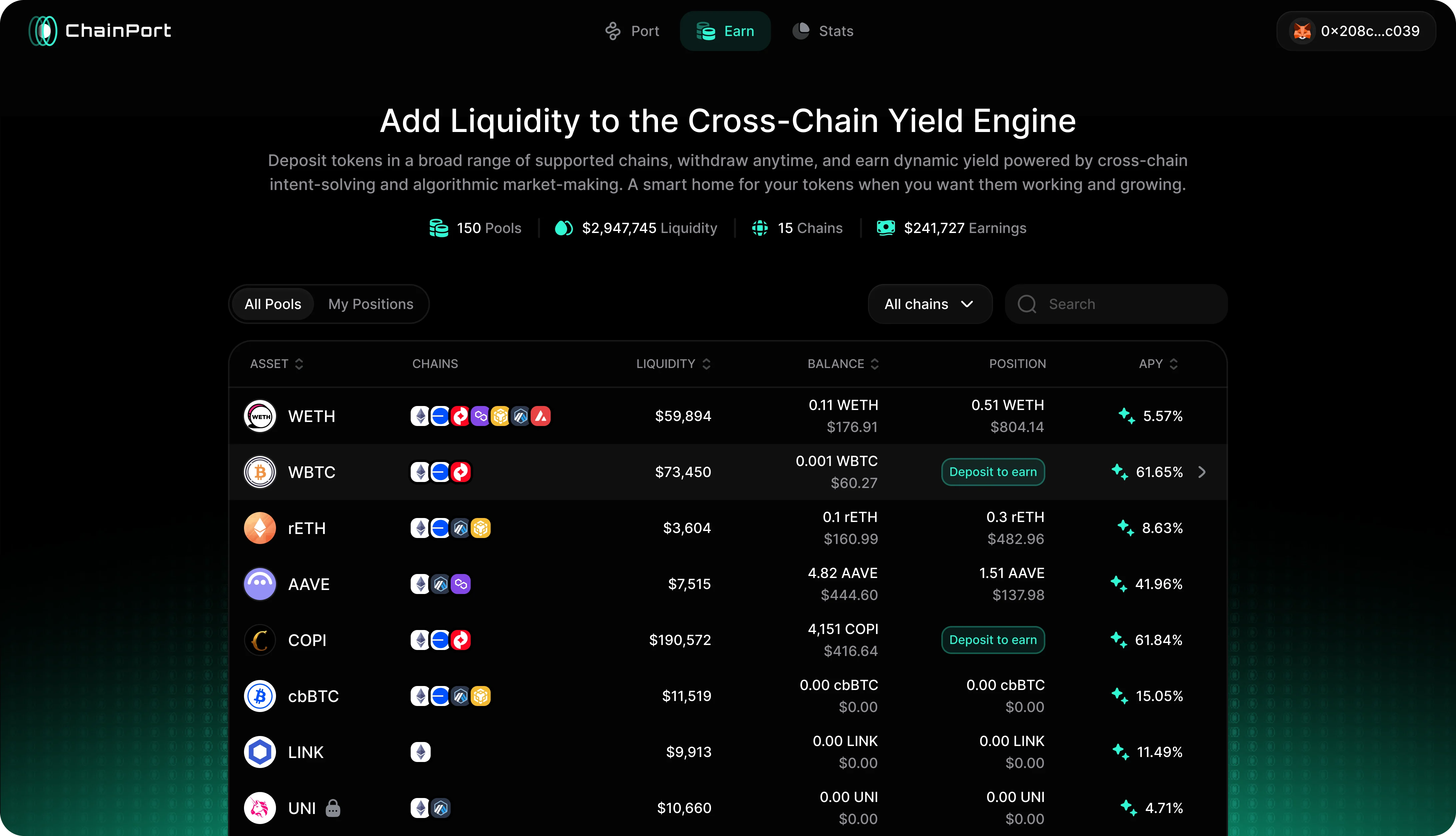
The hardest design problem was the Earn page: pool data, chain composition, activity, and a user's own earnings on one screen, all of it readable at a glance.
Earn had to be dense without turning into noise, so the hierarchy separates pool context from personal action.
Pool composition and activity stay together. The deposit and withdrawal panel remains within reach, with the user's position and earnings directly below it. Contract addresses, which the old design displayed at full weight on every row, moved behind a hover.
The information is still available without competing with what users need first.
The implementation had one big constraint: I had never written production code before. So I didn't touch the bridging or security logic, too risky, and kept all the work in the interface layer on top. Every change went through engineering review before it shipped.
One low-priority page didn't make it in time. Rather than delay the release or ship it looking broken, I applied the new color system to it and left its full redesign for the next version.
Solution
The rebuilt ChainPort behaves like one product. Explore and stats merged into a single section, activity moved into the wallet, and navigation went from six sections to three.
The wallet itself is now a drawer with three tabs: Assets, Activity, and Positions. It shows everything you own and everything you've done, one click from any screen.
The porting flow shows route options side by side, best rate versus fastest, with the fee and time for each. Our frontend engineer built the routing API integration, and I designed how the routes are presented and compared. Before, users committed to a route without seeing any alternatives. Same-chain swaps went into the same flow, so swapping a token no longer means leaving for another tool.
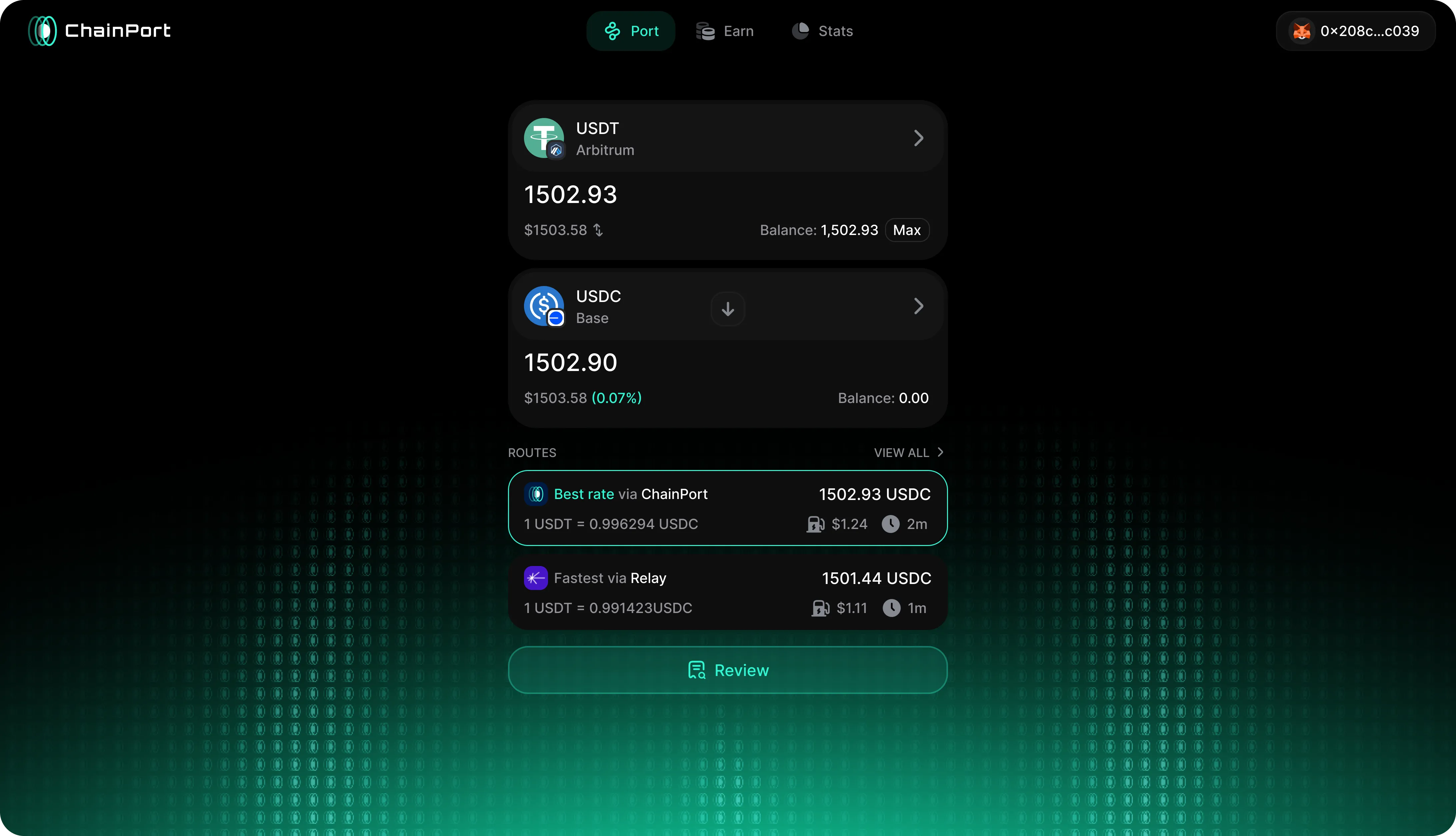
The amount input works in both directions: tap the dollar value and type in dollars instead of tokens. Nobody knows off the top of their head how much ETH $100 is, and the interface shouldn't make them guess. Small touches like this are everywhere: button states, transitions, motion. When it's your money on the screen, responsiveness is part of trust.
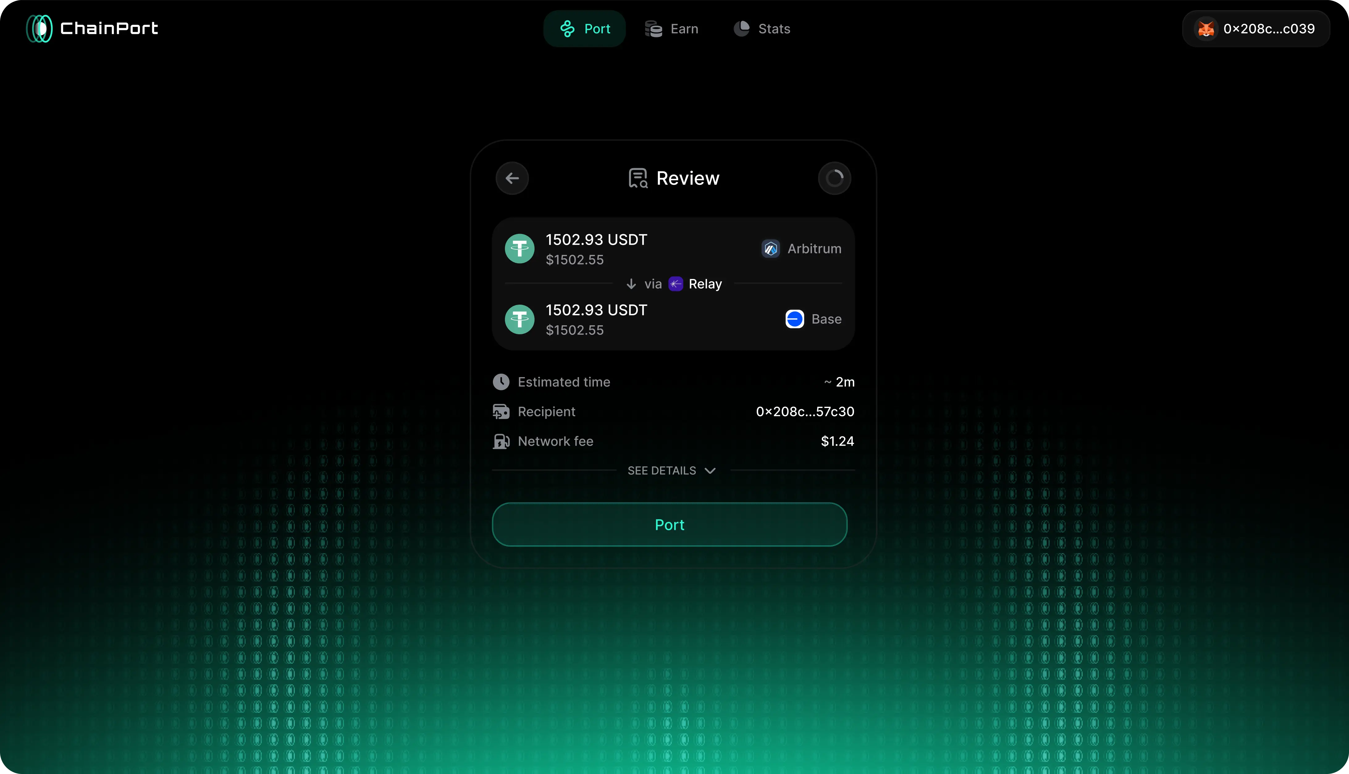
The Review step got the same cleanup. In the old confirmation, the amount you'd receive looked no more important than a contract address. The new one leads with the transfer, keeps the received amount, time, and recipient large, and moves rate, slippage, and price impact behind a details toggle.
I rebuilt the Earn table around the user's own positions, not just the list of pools. A My Positions switcher filters to what you hold, and a summary row totals positions and earnings. We also noticed that people come back after unstaking to check what they earned, so closed positions stay visible behind a toggle instead of disappearing.
Results & impact
It shipped.
- The full redesign is live in production for all users
- Route comparison and same-chain swaps shipped as part of it, both new to the product
- Navigation was reduced from six primary sections to three
- The design-to-code workflow spread to other products at the company
ChainPort’s $800M historical volume, 150,000+ ports, and $115M TVL predate the redesign, so I do not present them as results of my work. They show the scale and risk level of the product I was designing for.
I now design, build, and QA my own work, with engineering review before release. Work that once waited for an engineering slot can move as soon as the design is ready.